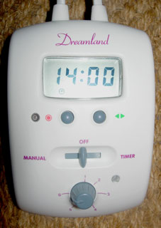
A few years ago, my wife bought an electric blanket for our bed. She did well- it’s wonderful thing and it keeps us snug.
But the usability of the control modules is so dire that it’s actually funny. Take a look…

Note…
- The cryptic red circle icon drifting between the on-light and the left hand button. Function: unknown.
- The green left and right arrows beside the other button. How does that button allow you to go left and right? It only has a normal press action.
- And the three way switch, that means that you can’t just turn the blanket on without really looking at the control to make sure you’re not accidentally switching into timer mode.
Still – let’s be thankful for the twisty temperature knob. It’s much better than a button-based effort.
Of course, this UI is the product of a company that wanted to save money on design. And we bought the cheapest blanket, so we really weren’t expecting the controls to be any good. It keeps us warm, and that is the most important part of the user experience.
But the issue is this. If they wanted to make the controls cheap, they should just have kept them simple. An on-off switch, a light and twisty knob would have been great. Instead they incurred extra engineering and manufacturing costs by adding timer features that no-one can use and that no-one really needs, especially not on the budget blanket.
How did it end up so?
The key fact: Simplicty is harder to achieve than complexity.
Engineers want to add features because it’s fun and challenging and because the features make sense on paper.
Marketers want to add features because they think it makes the product look more compelling in-store.
So put them in a room together and you’re not going to get anyone crossing features off the list.
Some solutions:
- Incentivise the engineers on sales. The more of their products that get sold, the bigger their bonusses. Nokia and Apple do it like this. By all reports, it works frighteningly well.
- Get the marketing department to start marketing the virtues of simplicity. It’s a competitive angle. For example: SimpleHuman.