Originally published on Memeburn.com
South African websites repeatedly make basic usability mistakes. The results: frustrated customers, negative brand impact, reduced online sales, and poor return on investment for the whole web project.
The best advice for making an impact online is to Zig when others Zag. Stand out. Be amazing. Give a shit.
But if you work for a South African corporation, I’m sure you’ll feel much more comfortable following the herd. So here are five instructions for making sure your ecommerce site delivers industry-standard quantities of pain and frustration.
1. Let the programmers write the copy
Here’s an error message Flow discovered during a usability test for MWEB. If you choose the wrong kind of password, you get a message that says:
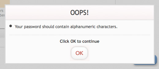
Oops indeed…
This kind of language is fine for programmers, but there are a lot of people who might want to buy an internet connection but are not sure what the word “alphanumeric” means.
So how about, “Please make sure there are both letters and numbers in the password you choose, to improve your online security.” Surely more people will understand what that means?
Usability recommendation for the inspired: You won’t ask a copywriter to program JavaScript. So don’t ask the programmers to write the copy.
2. Help users to lose their work (and their tempers)
I need to log into my Standard Bank account. I have to type in a 16-digit card number, a five-digit PIN and a 10-digit password. I am then presented with two identical buttons: login, or reset.
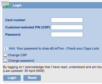
Can you think of any scenario where someone would want to type in all those numbers, and then clear the form? No?
But can you think of a scenario where someone might type it all in, and then accidentally click on the wrong button, thereby losing all his work and getting very annoyed with Standard Bank? Yes, because it’s happened to you, hasn’t it?
Usability recommendation for the inspired: Just get rid of the reset/clear button on your form. It serves no useful purpose.
3. Assume your customers know as much as you do
Your customers don’t know how your business works, or understand the complexities of the products you sell. They don’t care either. They just want to buy something that works for them. The job of your website it to present your goods to the customer like a salesman, not like a telephone book.
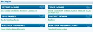
Here’s a choice example from Vodacom. I go to their website to see how much airtime I can get for my budget. I click “browse packages”, and get the following:
Hey what? I want a contract, but how am I supposed to know the difference between Talk, Weekender and 4u? Is Yebo4Less going to give me better value than Per Second Plus? If you work for Vodacom, this page will make perfect sense to you. If you’re just an ordinary Joe, it’s a complete mystery.
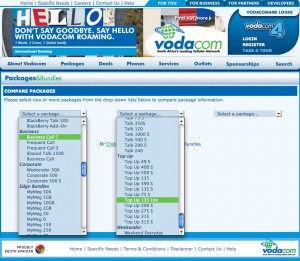
So maybe I’ll try the link that says “Compare Packages”. Oh dear:
Hundreds of packages, each one more incomprehensible than the last. Should I choose Top Up 135 S or Top Up 135 Lite? No wonder South Africans prefer to buy face-to-face if this is what they get online.
Usability recommendation for the inspired: Create personas: realistic fictional characters that represent your target customers. Then walk through the site from their point of view and see how it looks.
Or, hang out at your call centre for a day and listen to what customers are asking and how the call centre staff explain things.
4. Make it impossible to buy
If your website is selling something, it is vital that people should be able to buy it. Am I stating the obvious? In practical terms, that means that your forms should be the most rigorously usability-tested part of your site. Take the example below from SAA. I thought I typed in a perfectly reasonable request – I wanted tickets from Cape Town to London…
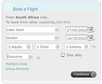
This is what I got when I pressed the Continue button…
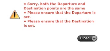
The Departure and Destination points are the same? But one says Cape Town and the other says London! (BTW, this isn’t a bug. This is caused by a weird field validation issue. Try it).
I’m sure SAA would have a perfectly legitimate technical explanation for what happened here. But from the user point of view, it just didn’t work. If I can’t even see the price, I certainly can’t buy the product. Not a good outcome for SAA.
Usability recommendation for the inspired: Watch your analytics after launch to see where people are getting error pages. You need to continuously improve your site – don’t just launch it and forget about it.
5. Create messy information architecture and crazy navigation
I went to the information desk at Absa because I wanted to change my daily withdrawal limit. The lady behind the counter told me that I needn’t have queued – I could just do it online. She then produced a handwritten and much-photocopied piece of paper, with instructions on how to do it. It’s not complicated, but it’s utterly obscure: you need to click on Service Information, then Registration, then Change Limits. I still have to look at the piece of paper every time I need to do this.

People find online information through something called Information Scent. It doesn’t matter if you have to click five times to get to the thing you want, as long as the “scent” is obvious. Clicking on “fresh produce”, and then “fruit” to get to bananas is a strong information scent.
Replicating such a strong scent for something complicated like banking terms requires careful design of your information architecture. But if you don’t do it, your customers will come and bother your customer service team. And that costs more.
Usability recommendation for the inspired: Try card sorting. Ask some of your customers to first name and then group the functions, by grouping little cards into piles. Then build a click-through and test some other customers to see if they can find things.
The very best way to boost usability
Top get change to happen, you have to persuade your colleagues that there’s a problem. Start with a usability test. Get 10 target customers, sit them down in front of your site, and record what they do. It’s the most vivid dose of reality your team or your boss is likely to get.
That’s the first step to building a site that sells more, with lower costs, to loyal, repeat customers. What a concept.
