DIS 2008 day 1: experiments with better interaction

“There are certain deficiencies of computers right now,” said one of the speakers at the DIS 2008 conference  today. And this first day of conference highlighted what researchers are doing to address those deficiencies.

Some solutions are more production-ready than others. I expected DIS 2008 to be “out there” and it is.

Deficiency 1: Interacting with computers feels unnatural.

Researchers are exploring speech and gesture to make interaction more like “everyday life”.

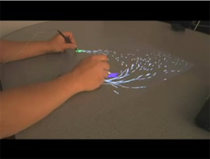
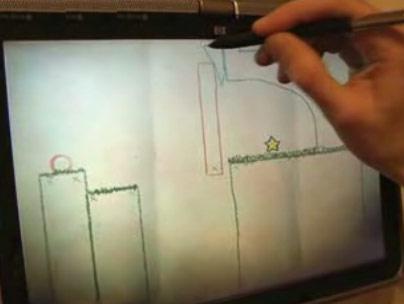
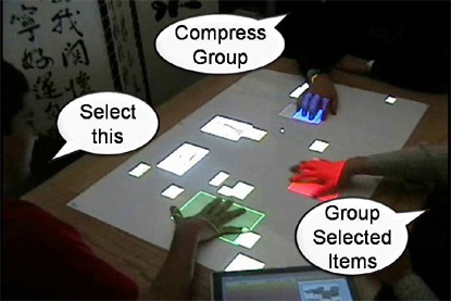
Edward Tse, from the university of Calgary, presented some great examples of speech and gesture interaction around a large digital table to allow people to collaborate on affinity sorting notes and images. I would dearly love to try this out on a design project.

Helping designers collaborate

Mixed reality allows us to interact with computers by manipulating objects, and our own bodies, in the physical world.

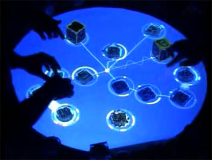
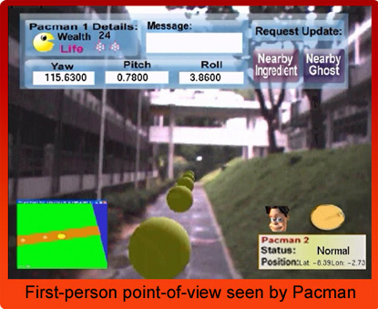
Adrian Cheok from The National University of Singapore’s Mixed Reality Lab demonstrated a range of mixed reality experiences, including “human pacman” where players arrayed with cameras, VR headsets, GPS and wireless data connections played pacman by physically running around an area of the city.

Human pacman in action: pacman's eye view

Deficiency 2: Computers demand too much attention.

The demands that media and information technology make on our attention every day have been shown to cause stress, mistakes and accidents.

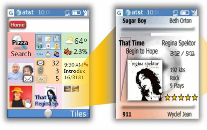
Daniel Robins, from Microsoft research, demonstrated some ideas for how to make a smart phone interface less demanding of our attention.

He makes use of three attention-saving approaches:

  1. Glanceable interface: This lets you soak up information when you have a moment to glance at it – without pressing any buttons at all. Daniel proposes dividing the screen into tiles, each of which surfaces a key piece of information. So not just “email” but “3 unread emails”; not just “appointments” but “Appointments at 11:00, 12:00 and 15:00 today.
  2. Muscle memory: This enables people to interact with the phone without looking, using “muscle memory”. Many of us can touch type, so we experience muscle memory every day. By dividing the screen into 9 “tiles” you can map to the 9 number buttons on the keypad. This means that people can select an option by knowing which position it sits in. They can just press a number and don’t need to look at the screen until the information they need is already displayed.
  3. Peeking: This allows users to view information quickly and briefly with minimal navigation. By holding down the corresponding key, users can temporarily display more detail about one chunk of information. Let go, and the display drops back to the home screen – showing all nine information “tiles”.

Tapglance interface allows you to get information with less attention

    Deficiency 3: Computers can’t communicate emotion very well.

    Software, computers and modern life can cause feelings of isolation. We use technology to combat that: an email or Skype call to a distant loved one can help. But these technologies are limited and that can limit the enjoyment of staying in touch. They let us share information, but are much less good at letting us share experience.

    Emotion and enjoyment come via touch, taste, physical motion, what we wear, subtle expressions – many things that current internet technology has no mechanism for communicating.

    So Adrian Cheok from Singapore’s Mixed Reality Laboratory has invented:

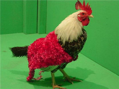
    • The poultry internet, to let you stroke your family chicken remotely (a family chicken is a fairly common pet in South East Asia). You stroke a soft dummy chicken, and the real chicken wears a fluffy “haptic jacket” which simulates the stroking on its body. Experiments show that the chickens love it.
    • Huggy Pyjamas, to let guilty parents still away at bedtime, hug their children remotely. The parent strokes a small device (something like a key ring in future releases) and air-filled actuator’s in the child’s pyjamas simulate the parent’s hug. The parent can send a signal to change the colour of a badge or patch on the pyjama’s too.
    • Age invaders, to let grandparents, parents and grandchildren play phsyically together. Some players play over the net, others physically move their bodies on a giant, digital board.

    A happy chicken in a

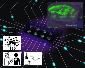
    Cheok’s team also note that many of us can empathise more effectively with living things that artificial things. (They give the example of real flowers versus plastic flowers: which would you prefer to receive form a loved one?) So to boost the empathy we feel when confronted with information by a computer, they have pioneered the idea of empathetic, living media: computer displays made out of living things.

    The Babbage Cabbage experiment lets you tend a garden of six real cabbages that change colour based on data feeds that you select. By injecting an acid or alkaline solution into each cabbage, the cabbages can be made to go from green to purple over a number of days, while staying alive and healthy. You can make the different cabbages respond to all kinds of information from four categories: personal, family, society or environment. Some examples information about your own energy usage, or the environmental impact of your travel behaviour, or how much you are communicating with a loved one via text messages. The team have reproduced the idea with transgenic, glowing bacteria and fish. Next they might try squid, or a display that attracts ants to different areas to make patterns.

    Glowing trays of transgenic bacteria reflect data feeds

    Research is not complete yet, but some evidence suggests that people really do feel more empathy when it’s a living thing that is displaying ambient data.

    More from DIS 2008 tomorrow.

Paying attention to your attention

An article on the BBC website recently gave readers a chance to comment on why they didn’t have a mobile phone (about 14% of British people don’t have them). Some of the mobile “refuseniks” highlight a well-known issue: attention and multitasking…

“Mobiles are like needy children, always wanting attention. I wanted to cut out the stress.”

The issue, dubbed “continuous partial attention” by Linda Stone, has been discussed for many years now. Linda points out that continuously staying on alert for new information from a range of sources simultaneously is actually bad for your health – mental and physical. She anticipates a new trend where we will select technologies that protect us from too much “noise” and allow us to focus on quality experiences, relationships and information.

A very entertaining article on TheAtlantic.com predicts a dramatic change in the way use out attention: a multitasking crash, followed by an attention deficit recession. The author, Walter Kern, discusses recent psychological research…

“Researchers asked a group of 20-somethings to sort index cards in two trials, once in silence and once while simultaneously listening for specific tones in a series of randomly presented sounds. The subjects’ brains coped with the additional task by shifting responsibility from the hippocampus—which stores and recalls information—to the striatum, which takes care of rote, repetitive activities. Thanks to this switch, the subjects managed to sort the cards just as well with the musical distraction—but they had a much harder time remembering what, exactly, they’d been sorting once the experiment was over.

Even worse, certain studies find that multitasking boosts the level of stress-related hormones such as cortisol and adrenaline and wears down our systems through biochemical friction, prematurely aging us. In the short term, the confusion, fatigue, and chaos merely hamper our ability to focus and analyze, but in the long term, they may cause it to atrophy.”

Social tools consultant and writer Stowe Boyd disagrees. He suggests that human consciousness can handle multiple attention demands simultaneously, and get a lot of joy and satisfaction out of it. He points out that we’ve been doing for as long as we’ve been humans…

“One Eye on the flint we are knapping, and one eye scanning the savannah for predators, chatting the whole time.”

Pay attention to you

I can only conclude that everyone’s capacity for and attitude to continuous partial attention is different. Some people are very social, and enjoy flitting between conversations at the virtual cocktail party. Others prefer deep, zen-like focus on a single task. And some of us will mix and match depending on what the day brings.

But whatever your natural ability, it’s important to make sure that you use your attention the way your want to – don’t let the technology control you.

Watch yourself for the next week. Are you spreading your attention so thinly that you end up stressed and exhausted? Are you actually getting anything done? If not try this:

  • Reduce the number of communication channels you use. Do you really need twitter and facebook and a blog and e-mail Skype and MSN Messenger and text messages…? Really? Choose a few channels and let people know that those are your preferred ones.
  • Set chunks of time when you disconnect from some or all of your channels. For example…
  • “[…] in recent weeks prominent bloggers have been choosing to disconnect. Ken Camp turned off Twitter for a week, and didn’t miss it. Robert Scoble announced last week that his blogging would be slowing down, because he was going to work on getting back into shape. Mark Evans has chosen to not check BlackBerry mail after 6 PM.” (Saunderslog)

  • Use technologies to help you filter the noise and free your attention. Servcies like Digg or Amatomu will select the best things for you.

Now stop reading this, go find a good book, get comfy and read that for a while instead.

(Thanks to Martin Storey and Simon Johnson for the pointers.)

1 anti-strategy for prospering in a downturn

Thanks, Debre, for pointing out the strategy that Starbucks have been following: cutting costs and downgrading service in a bid to stave off competition from MacDonalds.

From the Guardian…

The troubled coffee chain Starbucks, renowned for its elaborate frappuccinos and mochas, is going back to basics by testing a cut-price brew costing only $1 (51p). Fighting slowing growth at its US stores, the firm is offering an eight-ounce “short” measure of ready-made coffee for a price undercutting fast-food rivals such as McDonald’s in a trial at branches in its home city of Seattle.

This looks like an appalling strategy. For the simple reason that it focuses on coffee.

Experience vs Commodity

Starbucks didn’t build a business on selling coffee. Coffee is cheap. They built a business on selling a customer experience.

The term they used was a “third place” a restful, aromatic, aesthetically pleasing, sociable space that is neither work nor home. Coffee was the hub of it, but without the surrounding experience, would any of us really consent to pay two pounds a cup?

Apparently, the experience is now all but gone. And hence it’s becoming rather difficult to justify the price tag for coffee alone. More from the Guardian…

Schultz recently warned in a leaked internal memo that the brand’s charm was in danger of diminishing as it became a mainstream “commodity”. He said the sense of theatre had evaporated, thanks to automatic espresso machines, and he complained some stores even no longer had an aroma of fresh ground coffee due to vacuum-sealed packaging.

A starbucks coffee dispenser - no no no!

Innovation pundit Bruce Nussbaum relates his recent experience of walking into a Starbucks in New York City…

I thought […] I’m going to feel like a sausage on an assembly line, waiting, talking to people not paying attention, then waiting again. And for what? A cup of coffee? It was all so transactional. I don’t need Starbucks for that.

CEOs who get it

Apple has been down this road. During their darkest hour, they were producing a bewildering array of uninspiring machines and an ageing, unreliable operating system. They wanted to compete with the frequently drab IBM PC clones, and in so doing seemed to forget their “think different” mantra. It was Steve Jobs, much to everyone’s surprise, who put Apple back on track by helping it deliver a unique user experience again – starting with the brightly coloured iMac.

It seems that Starbucks has also smelled the coffee. Howard Schultz, the newly appointed chief executive is the guy who built Starbucks up in the first place. He does seem to know what he’s doing – note that he talks about the “sense of theatre”.

So why the $1 cup of coffee? No matter home much pressure Starbucks is under, competing on price to “lure” customers back in doesn’t make sense for an experience-based company. Better to refurbish the stores, refocus the staff and refresh the coffee. Then let word of mouth bring customer back for what they were always buying anyway: the experience.

3 design-based strategies for beating an economic downturn (Part 3)

The strategies, as mentioned in the previous post:

  1. Innovate your way out
  2. Optimise, to squeeze more from what you have
  3. Cut costs by improving the customer experience

Let’s take a look at strategy 3.

Cut costs by improving the customer experience

Customer experience got a mention in the previous post. It’s the idea that every interaction that a customer has with your organisation, via whatever channel, contributes to the impression they form of your brand. Your branding and advertising makes a promise. Customer experience is about delivering on it.

There are two ways to use customer experience design to save money:

  1. Encourage your customers to migrate to lower cost channels
  2. Reduce the overall service load by building a customer experience that works

Encourage your customers to migrate to lower cost channels

Many businesses have found that the web is now channel to market. That’s great, customers love the flexibility and business love the cost savings. So, to reduce costs in a downturn, make sure that your customers migrate to the channels that cost you less. Hardly rocket science.

But actually getting customers to migrate can pose a challenge. How do you persuade them to move?

Some businesses have been known to deliberately increase call queuing times to encourage customers to try online self service. This is a good way to annoy customers. Others have tried customer education campaigns – generally a good way to bore customers. In reality you can’t force people to use a channel they don’t want to. You can only entice them with a great website customer experience.

BA.com entices you to check in online

A great example: British Airways. Their strategy is to reduce the number of staff on check-in desks. To do that, they need to reduce the duration of each customer check-in. And to do that, they need to get customers to adopt online check-in. The BA.com website has been steadily optimised over the years. It has reached the point now where I actively choose to fly BA, just so that I can use their online check-in. It’s easy and clear, you can select your seat easily, and you get to zip through check-in quickly. They’ve enticed me to use their online channel and everyone wins.

Reduce the overall service load by building a continuous customer experience

When things go wrong, customers want to talk to a human being quickly and set things straight. Enabling human contact is a reality of delivering a good overall customer experience. But a typical call centre call can cost between 7 and 20 pounds to handle, when you factor in facilities, training, salary and benefits. So avoiding the events that generate call customer service calls is very important for controlling costs.

Customers call when they encounter a breakdown in the continuity of a customer experience. A breakdown can occur at different levels:

  • Within channel: Eg. One member of staff has no information about a previous conversation with a customer. This kind of stuff is quite rare, mercifully.
  • Between channels: In one project, Flow found that customers referred to the online channel found registration so difficult and confusing, they had to call the call centre back to get help.
  • Between organisations: In one Flow project, we discovered that customers could not top up their mobile phone accounts because the 3rd party retailer they had bought from had not correctly registered the sim card and provided the customer with a PIN. Another example: incorrect payment details on an airline website generated calls to a the airline, but also to the customers banks.

How to build a continuous customer experience:

  • Hunt down the discontinuities. Look at call centre logs. Look at website logs. Interview retail staff. Run a research project to get “mystery shoppers” or real consumers to try the process out for you.
  • Work out the cost of the discontinuities. How many calls does it take to address the problem? What opportunity is missed if the customer fails to resolve the issue? How many customers are encountering the problem? Multiplying the numbers up will give you a rationale and a business case for choosing particular problems to address.
  • Fix the discontinuity. Often, a small fix makes a big difference. Making sure a piece of information is made available in the right place at the right time often does wonders. But sometimes the fix will require major system alterations. If those changes can’t be justified or undertaken in the short term, look for a way to patch the service: a work-around. (I blogged an amusing example of this a while back: Microsoft’s new software boxes are hard to open, so Microsoft patched the issue and published instructions online).
  • Measure the results. To prove the project made a difference, look for reductions in the relevant call types. Look for increases in usage of the problem channel. And the most powerful evidence of all: look for improvements in your bottom line.

Organisations that work to improve the customer experience benefit from reduced costs. They can entice customers to the most cost-effective channels and they generate fewer negative customer experiences and fewer expensive service calls.

Idiots who don’t know which buttons to press

Charlie Brooker in The Guardian…

“I love a complicated TV remote. They should have more stuff on them: dials and joysticks and flashing lights. I dream of a remote with its own mouse.”

Charlie Brooker’s rants in the guardian are usually entertaining, and I’m always delighted when they touch on user experience.

This one is a giggle because some of the readers seem to have take Charlie seriously.

“I couldn’t agree more. Technology is the one area in which people are proud to be utterly ignorant and helpless. No one would say ‘I can’t feed myself, and I have no control over my bladder, because it’s just too complicated’ but not knowing how your phone works is a badge of honour for many. I’ve asked my mother point-blank ‘You honestly think a few hours of learning how to use the remote is less appealing than not being able to use the telly?'”

“I completely agree with the whole customisation thing. I customise my PC settings to the nth degree and get unnecessarily irritated by my nearly entire office who still have the default settings for screensaver, etc.. How people can handle the bright blue XP default skin is completely beyond me.”

Scroll through the comments and have a look (also worth it for the hilarious examples).

Steve Jobs points out that the Apple remote has rather fewer buttons

I guess it highlights this point: to people who have a strong aptitude for technology and enjoy working with it, the subject of user experience seems bizarre and pointless. These people are very often the ones who design and build the interfaces we use. I often end up working with them…

“Do we really have to cater for these idiots who don’t know what they are doing?” they ask me, exaggerating the problem for effect.

“Yes,” I reply, “because those ‘idiots’ constitute most of your target market and their money will pay your salary.”

The antidote is usually a round of usability testing. Watching real folk try out and struggle with the prototype product has a very sobering effect.
Charlie puts forward an alternative…

“And if people still refuse to learn, let’s force them into it. Replace all supermarkets with complex remote-control vending machines that dispense food only if you can successfully navigate your way through a 25-tier menu system. And make it illegal to pass the food to anyone else. Before long, we’ll starve the idiots out of existence; manufacturers will never have to simplify anything ever again, and we’ll enjoy a golden age of buttons and options and adjustable sliders and a/v input connector 1. Now that’s progress.”

3 design-based strategies for beating an economic downturn (Part 2)

The strategies, as mentioned in the previous post:

  1. Innovate your way out
  2. Optimise, to squeeze more from what you have
  3. Cut costs by improving the customer experience

Let’s take a look at strategy 2.

Strategy 2: Optimise to squeeze more from what you have

This is primarily a marketing strategy. The idea: find out why your customers buy, and what stops them from buying. Then do more of the good stuff, and fix the bad stuff.

Digital marketers make a lot of noise about acquiring new customers. That’s certainly an essential element of a successful business. But keeping your customers happy when they get to you is worthy of at least as much attention. There’s a rule of thumb: acquiring a new customer is 6-10 times more expensive than retaining an existing customer. So a solid strategy when times are hard is to plug the holes in your “leaky bucket,” and stop website visitors from pouring out as fast as you can pour them in.

A leaky bucket, by trosanelli

(The data that actually supports the rule of thumb is hard to come by. And I think the cost of retention is tricky to calculate because customer retention comes from good customer experience, and that comes from every area of your business. But there is some useful data quoted here at Wikipedia).

The key words: conversion and loyalty

Conversion is about making a prospective customer actually complete a transaction and buy something from you. Loyalty is about bringing them come back to shop with you again.

Ways to improve online conversion

Some good, cheap tactics:

But there’s a problem. None of them ever brings you into direct contact with target customers. And that means that although you when customers drop out, you never know why customers drop out. What was missing from the product descriptions? How did the buying process not match customer needs? What did competitor websites do for them that yours didn’t?

The best way to optimise is to mix stats with usability tests. Stats tell you what is going on on your site, and where trouble spots may lie. Usability tests tell you what the causes of the problems are and what customers really want from you.

So. Killer tactics to really improve conversion:

  • Run face to face customer tests to understand usability, customer intention and customer workflow
  • Use intercept and track tools on your website to mix free-form response with clickstream recording

Ways to boost loyalty

Loyalty comes from an emotional connection. Here are some things that cause positive emotions about websites:

  • Human engagement. Two good solutions: an approachable style and an online community. (Firebox.com is a good example of both).
  • Polite interaction. As customers we want suggestions and ideas, but we want to stay in control. We don’t want hard sell, intrusive questions or spam. If we feel free to walk away, we feel safe to come back.
  • Getting what you want. Google has built the world’s most powerful brand by giving people the information they want reliably. And Amazon suggest books and CDs you didn’t even know you wanted, but invariably find that you do. Both of these sites have gone the extra mile in making it easy for customers to find things. Because if customers can’t find things quickly, they won’t stick around.
  • Customer-first behaviour at all touch points. As a customer, I have to know that you will look after me. If my item is lost during shipping or if I want to return it – give me the facility to sort my problems out quickly and efficiently online. And of course, Amazon is reknown for the high standard of care they offer right through the customer experience. And they’re looking good because if it.

Improving conversion rates, and building customer loyalty are really important strategies for surviving and prospering in a downturn. And often, its easy to make improvements in small steps too.

You’ll love part 3: Cut costs by improving the customer experience.

Fun to watch:the touch/movement revolution

There’s a fundamental change coming in the way we interact with computers. Multi-touch and gesture are here. Although the iphone and the Nintendo Wii have already build products featuring these new approaches, it might still be 10 or 20 years before the technologies area really mature. It has taken 20 years to get this far.

Still, things are moving and there are plenty of exciting things to look at.

Johnny Lee from Carnegie Mellon University is hacking the Nintendo Wii to come up with some heath-robinson, motion-based interaction ideas – that don’t cost a fortune. His efforts include the head-tracking desktop VR display and a multi-touch whiteboard.

Johnny Lee's home made Wii whiteboard

More about Johnny Lee’s projects here.

The reactable is mixing real objects and on-screen action, and doing it for several users at once.

The ra

LG.Philips have launched a mammoth-size touch screen (they only allow two touches at once, but still – not bad).

Giant touchscreen

And this depth-sensing camera allows computers to track your motion in 3 dimensions. It promises Wii-style gaming, but with no remote, by the end of 2008.

3D motion sensing camera

Thanks to Aoife Ni Mhorain, Haroon Kwahja and Gerrit Giliomee for the pointers.

3 design-based strategies for beating an economic downturn (Part 1)

The economic prospects for 2008 don’t look too promising for the world’s most developed economies. We’re in for a slowdown, or possibly something worse.

When market conditions change, it stands to reason that a change in strategy can make sense. I’ve got 3 design related strategies that will prove useful if there are lean times ahead.

  1. Innovate your way out
  2. Optimise, to squeeze more from what you have
  3. Cut costs by improving the customer experience

There’s quite a lot to each one of them so I’m going to post them one at a time.

Strategy 1: Innovate your way out

If you’re not going to make enough money from what you’re already doing, come up with something new for a new source of revenue.

Apple provides an impressive example. Here’s a quote from the San Francisco Chronicle in 2001, when times were hard for the IT industry and the whole US economy:

“Apple has maintained its workforce at about 11,000 throughout the year. In a meeting with analysts last week, Chief Executive Officer Steve Jobs said: “Almost every single competitor has been doing massive layoffs and retrenching and restructuring, but we’re doing quite the opposite. We’re not laying off boatloads of people. We’re taking those talented people and saying that if we’re going to get out of this, we’re going to get out of it by innovating our way out of it.”

If you have managed to put some cash put by for a rainy day, Steve Job’s approach is a good way to go. But only if you know how to innovate properly. Innovation doesn’t mean throwing money at blue sky projects and hoping for miracles. You can cut out masses of risk by using a structured design process:

  • Contextual research. This isn’t market research with surveys and focus groups. Contextual research is about observing and participating in people’s lives to get the dirty truth about what they need, what they want and how they behave. The innovation often seems obvious when you’ve got the right information.
  • Conceptual thinking. Get your team together. Have lots of ideas. Stay out of the details and explore the new and usual stuff – that’s where inspiration comes from.
  • Evaluation with target users. Make cheap prototypes any which way you can, and watch target customers try it out. Even if the feedback is not what you want to hear, it’s better to face harsh reality in the R&D lab than out in the open market.
  • Iteration. Your first attempt will be shaky. Keep testing and fixing your product’s design until your customers tell you its ready.

Start now, and ride the up-cycle

Depending on your line of business, getting a new product design and launched can take a while. So innovate during the downturn, when talented staff are at their most faithful and affordable, and be in position to ride the up cycle when it comes.

When times are hard, it feels safe to keep a low profile – cut back, don’t take risks. But if your current strategy doesn’t fit the climate, doing nothing might well be riskier. If you’d like more insight into how innovation can help businesses prosper, Bruce Nussbaum has a list of ten books you should read.

Strategy 2 will be: Optimise, to squeeze more from what you have.

OLPC: Small thinking vs big thinking

A great quote from an OLPC spokesman about why some governments are not following through on ordering educational laptops from the OLPC initiative.

“It has not been that processor versus that processor or that operating system versus that operating system – it’s been small thinking versus big thinking. That’s really the issue.

Change equals risk especially for politicians. And we are certainly advocating change because the [education] system is failing these children.”

However, a Nigeria’s education minister replies,

What is the sense of introducing One Laptop per Child when they don’t have seats to sit down and learn; when they don’t have uniforms to go to school in, where they don’t have facilities?

Maybe you don’t need a seat or a uniform or a roof to engage productively with a computer. Purveyors of mobile computing in developed countries are trying to convince us of that. But other studies say hyper-mobility is a myth: you need somewhere safe and quiet before you can do any real thinking. Maybe it just depends on the person, and the context they are used to existing in.
Young girl carrying XO laptop

See the BBC News article: Politics ‘stifling $100 laptop’

There’s also some great video and a wonderful slideshow of trials in Nigeria.

Crayon Physics: great game interaction

Crayon Physics is an amazing little game that has attracted a lot of attention. It’s wonderful fun to play and it can teach us a little bit about interaction design too. Thanks to Aoife Ni Mhorain for pointing this one out.

Crayon Physics in action

Experimental game play

Petri Purho is a student at Helsinki polytechnic. He has set himself the task of producing a new game every week – and each one has to test out a different form of experimental gameplay.

With Crayon Physics, Petri appears to have hit on a winning idea. He’s had such demand for a more complete version that that he’s had to break his own rules and work on a version that will take more than 7 days. There’s a very cool video of it here.

Crayon Physics Deluxe on a tablet PC

Get out your crayons

As you can see in the pictures, Crayon Physics is styled to look like crayon drawing on an old piece of paper. You create new objects by drawing them – sticks, blocks and balls. And the moment you create those objects they gain physical properties. The fall, they topple, they roll, they land on top of each other.

Fun! And the lessons are?

Lesson 1: Good interaction design builds on things we are familiar with

We’re familiar with all sorts of objects and rules about the world. A folder holds documents. You can put sheets of paper on top of each other on your desk. And you can throw them away in a trash can. The original Xerox PARC interfaces showed how computing could be made approachable by using on-screen metaphors for everyday objects and actions: folders, windows, trashcans.

Crayon physics is easy to learn because it uses the laws of physics we already know. Things fall, things land on top of each other, heavy things can be used to lever light things.

More recently, Apple has been pioneering some advances in this space by incorporating “physics”, now very advanced in the world of 3D games, into its software. The iPhone/iPod interface provides “momentum” – if you’re scrolling through a long list, a good flick of the finger will keep the scrolling going for a while until you put on the brakes again with a stationary finger.

Lesson 2: We want cave-man magic

Everything that computers do for us is to some extent magical. We can create beautifully typeset documents, we can communicate instantly over large distances, and we can move mountains of data with minimal effort.

Drawing a crayon picture and having it come to life is magical. Much more magical than word processing. I think that’s because the activity that crayon physics is simulating is much closer to our most primitive human ways of thinking. Typing on a qwerty keyboard is quite an unnatural thing for us humans, and its history comes from interacting with heavy, mechanical machines. Drawing with a rough coloured stick is very primitive and very appropriate to the way our cave-man brains evolved. Seeing our basic scribbles transformed into moving objects feels very magical indeed.

The next generation of user interfaces, with multitouch and gestures, are all tapping into this. Using two hands to drag, stretch and pinch gets right back to the fundamental activities out brains evolved to perform. And it feels great.

Lesson 3: Sketch prototyping is a great way to think

I wrote recently about the power of sketch prototypes. And Crayon Physics illustrates the point. Some of the puzzles are hard to solve, especially on some of the add-on levels. But you can try out different ideas with very quick sketches and it really helps you build a solution. Sketching really is a great way to think.

Anyway – enjoy Crayon Physics. And If you get bored of that, the Experimental Game play Project has about 360 other innovative games to try. I think I’ll try “Tower of Goo” next…