A balanced user experience starts with the box

Recently, Joel Spolsky pointed out the brilliantly obvious: the groovy new boxes for Microsoft’s next generation of software offer a poor user experience. As Joel points out,

A box that many people can’t figure out how to open without a Google search is an unusually pathetic failure of design.

For those of you who want the full details, my colleague Karl Sabino has dug out the official Microsoft help page for opening the box.

1. Cut the tape along the edges of the box

2. Peel the label off the front of the box3. Pull the red tab to the right to open the box

Yes that’s right. A help page for the packaging.

I’d love to know the traffic stats for this page. By assuming that each page impression corresponds to about 10 minutes of user frustration, we could calculate the total amount of customer time wasted by this nonsense.

Still, I guess we should be thankful that the same designers aren’t working on the escape slides for Boeing.

Balancing easy, useful and delightful

Microsoft have recently been talking about the importance of the aesthetic quality of a good user experience. Good for them. It’s very important. Beautiful products make us more likely to try them out and, by putting us in the right frame of mind, make us more effective at actually using them.

But this box seems to illustrate the problems of going too far towards the aesthetic, and forgetting the easy/useful part of the equation. It’s cute, groovy, cool – but it’s a pain to use. And that’s not a balanced user experience. That’s where the web was back in 1998, and we all thought things had moved on since then.

“It’s a business requirement”

Maybe the box is hard to open for business reasons. Perhaps its some anti piracy measure or linked to the licensing agreement.

That’s no excuse. If a business “need” inconveniences customers, it needs to be re-thought. Why? Because if you treat your customers badly, they’ll treat you badly – asking for additional expensive support, requiring heavy marketing expenditure to avoid churn, damaging your brand with negative blog posts. Which all cost you money in the end. In the words of Colin Shaw, “You get the customers you deserve.”

Patching the hole

One thing that Microsoft have done right: issued a “service patch”. They know there’s a problem with the customer experience and they’ve done what they can in the short term to take the edge off the problem. They’ve published a web page. The next step is to stick the instructions to the box, so that you don’t have to search the web to find them.
Son forms software company to resurrect dad’s genius ideas

Thanks to Darryl Hebbes for pointing me towards this one: Humanized Inc.

In the eighties, one of the original Apple Mac gurus, Jeff Raskin, came up with some crazy ideas about human computer interaction. Most of his ideas were just too radical. Now his son is taking those ideas forward with a new business venture.

The design trip

One of Jeff’s inventions was the auto-cancelling, semi-transparent notification. This was a “crazy idea” but it’s- now built into many email clients and mobile phones.

Jeff was also the first to point out the the whole concept of file names and the way that file-save and file-open work are actually fairly “in-humane” – they don’t match the things we as users want to think about, when we want to think them. And he was a big fan of GOMS – modelling the most efficient way to get an operation done in terms of keyboard and mouse clicks.

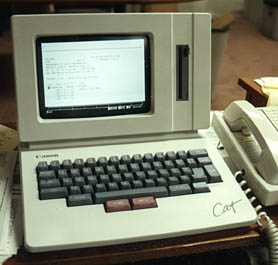
The design trip culminated in the creation of the Canon Cat. A computer with a radically different approach to the user experience that Jeff called a “humane” interface. It featured “Leap keys” and kind of continuous notepad – you never really created files, you just started a new page. You used search to find the page you were looking for. It flopped wildly.

The canon cat

Raskin wrote an amazing book called The Humane Interface which I would REALLY recommend.

Jeff died in 2006. Many of his most radical ideas are sitting out there waiting to be brought into the main stream. They make a lot of sense, but you just need to think outside the paradigm of how you use computers at the moment. (After all do you really find using your computer effortless? Of course not. Maybe Jeff’s ideas can make that happen.)

Enter Humanized Inc.

It’s a new company recently set up by Jeff’s son. How cool.

They’ve started with a tool to make it easier to start applications and bring windows to the front. They’ve also got a special spell checker. They’re working on an RSS reader next. I can really do with that last one.

When it comes to easy software they recommend the “Telephone test”:

We ask ourselves, “Would I be willing to teach my Grandma how to use this over the phone?”. If the answer is “Definitely”, we know we’re doing well; if the answer is “Maybe”, we know we can do better; and if the answer is “No”, then it’s time to rethink the whole thing.

I think this is wonderful.

XO-1 Laptop: Inclusive design triumph

As well as designing the operating system to match the users and the context of use, the OLPC folks have focussed on the hardware needs of children in developing countries.
The XO-1 laptop is bash-proof, sand-proof, splash-proof. You can charge it up in the sun or by winding it up. It’s got no moving parts, apart from the main hinge and two chunky wi-fi antennas. The screen works has a mode that works in bright sunlight. Clever.

The XO-1 laptop

And isn’t it funny that in the process of developing a laptop for kids who live in dusty rural villages, they’ve also invented quite a lot of hardware that “traditional” users all over the world would also like? I want to be able to wind up my laptop as I sit on a train. I want chunky, gin-and-tonic-proof industrial design. I want a screen that works in bright sun.

This kind of thing happens often. Teams start off by thinking about the needs of a minority group, and end up making a product that’s better for everyone. For example:

  • Good Grips vegetable peelers for arthritis sufferers – actually great for everyone who wants to peel vegetables in comfort
  • Curb cuts for people in wheel chairs – also good for mums with pushchairs, and for rollerbladers
  • Large fonts and shortcut keys for computer users with disabilities – also good for expert users with hi-res monitors.

It seems counter intuitive at first. Designing within tight constraints for a demanding group of users sounds like it would stifle creativity. In fact, it tends to yield some of the the very best design there is. That’s why many interaction designers say you should aim your product at just a single persona.
Yet again, designing for this “minority” audience (of 1.2 billion children) seems to have delivered something useful for everyone.

XO-1 laptop: A success in one form or another

After 5 years of work, OLPC are ready to start rolling out the XO-1 laptop to children in developing countries. Those are the children who live in villages without water, electricity, and sometimes even decent medical care.

XO-1 in use in Ban Samkh, northern Thailand

It sounds like insanity. And opinion is divided about whether it is in fact insanity or not. Is the XO-1 an imperialistic, American artefact? Will its batteries and screens pollute the environment? Should the money be spent on libraries, and clean water? Will it be used to surf porn? Will it drive black market crime?

The answer to all of those questions is “yes – to a degree”. But none of those problems are insurmountable.

The real question is: does anyone want it?

The XO-1 doesn’t run Windows: it runs a special operating system of its own with an interface called Sugar. It does have a web browser, PDF reader and the like. But you can’t run MS Word on it. Sugars look cute and has some clever thinking behind it. But there’s some doubt about it.
One very strong argument says that prospective users in developing countries don’t want a “non-transferrable skill”. They want to learn Windows, because Windows is what the rest of the world uses, and Windows skills will get them a job when they leave school. This could be a problem. Even though they are now part of the OLPC initiative, Intel is continuing with is Classmate programme – a PC with some of the same characteristics as the XO-1 but able to run Windows. Add to that a massive base of downloadable Windows software, the classmate looks tempting.

But the lack of Windows OS may also be the XO-1’s saving grace. The modern desktop interface that we know is a complicated beast with lots of cultural and no-so-easy-to-learn assumptions embedded in it. Windows is ok for kids, but not fantastic. Sugar bypasses those issues. Designed and tested with kids in the real context of use, it’s likely to work well because it will fit properly into the lives of the people it’s aimed at.

To be a real success, the XO-1 needs to build a community of its own. The children and teachers who use it need to be able to create new things and share with each other. This looks like it could well happen. There are authoring/development solutions called eToys, Scratch and Squeak. And the mesh network allows XO-1’s to communciate with each other to pass new ideas and information on.

My money’s on it

If the children learn how to make the XO-1 do things that children love – communicate, play and invent – I think XO-1 will be a success. It won’t matter if it’s an American imperialist plot, or diverts money away from libraries. Gripes about it will be incidental to the market demand for an empowered and empowering, self-oragnising, kid-powered network of many millions of nodes. And controlling it will be all but impossible.

I’m probably an idealistic, techno-centric, Western fool. But I really hope that’s how it works out.

Airline meals: beautiful presentation improves the user experience

My stats show that you everyday user experience stories have the greatest mass appeal. You seemed to like the posting about Delta airlines. So here’s another quick one.

I went on a BA flight from Capetown to London recently and was astonished to find the food was very good. They seemed to have thought hard about what they could reasonably do to an economy class meal to make the experience better. They did two things:

  1. The made it TASTE nice. Which is, I think we can all agree, the most important thing they could do.
  2. They made the packaging look nice. Often you get a mystery meal with a plain foil lid with “chicken” or “beef” dot-matrixed on the top. Here the food packs had pleasant pictures on of what was inside. They were like the gourmet-meals-for-one packaging from a British supermarket. Looking at a tray full of colourful packaging made me feel more positive about the food before I even opened the packs.

Taking a photo of my meal would have required me to leap over other passengers to reach the aisle and my baggage locker. But luckily, it seems others are better prepared. At airlinemeals.net at least 500 people have sent in pictures of their airline meals for British Airways alone. Right.

A British airways meal much like the one I had

There seem to be plenty more for other airlines too. Including Aeroflot which features this very special submission on the list:

This aeroflot meal suffer from particularly bad presentation

The Chinese airlines all seem to offer things that westerners can’t fathom. But most seem to forgive them, simply because the packaging is so beautiful. As the UX community has (re)discovered over the last few years – people respond more favourably to and have a better user experience with beautiful products.
Lovely packaging from China Xinhua Airlines

British Airways have got the right idea. Promise a good user experience with well designed packaging, then deliver against the promise with a tasty product.

Sort by medium vs sort by genre

Does anyone know of any research about this:

Theory: people sometimes (often?) choose web activities by medium, rather than by content type.

So as well as saying “I want news” people sometimes say “I want photos” or “I want video” or ” I want blogs”. So aggregating lots of examples of the same medium can be more effective that addressing one genre of content with several media mixed together.

Consider:

Vs. a site like BBC news which mixes video in with copy. (Except they’ve also got a video and audio section, I note).

Is this obvious? Does anyone have any additional evidence?

Webcakes: bribe a blogger

I went to 27dinner last night in Cape Town, set up by Dave Duarte. They had cakes with amusing, web-related icing on top. Just like Stormhoek, the idea is that if you give a blogger a freebie to blog about, you’ll go far.

Works for me!

Amatomu and Open Source cakes

Well done Charly’s Bakery and well done 27 Dinner.

If you are in South Africa, check out the next 27 dinner. You’ll see quite a cross section of Web folk there, talking everything from complete sense to utter nonsense. Take business cards and whiten your teeth before you go.

EVERYONE is impatient with a bad user experience

This from my friend Nick Bowmast at Flow…

The British have a reputation for patience, politely queuing for hours for the latest Playstation or the Kate Moss collection at Top Shop. But this patience does not extend to online activities, according to the results of a new survey.

According to results published by GBC on behalf of client PacketExchange, 70 per cent of British surfers would give a site less than 10 seconds to load before starting to search for an alternative, behaviour that is not mirrored offline.

In contrast to the virtual world, the nation of queuers were more than happy to wait up to 15 minutes in a nightclub or post office queue. Slow web pages weren’t the only pet peeve of the internet shopper, with poor web design (50.4 per cent) and crashing websites (52 per cent) [cited] as other annoying traits of their online experience.

Survey respondents didn’t just give up at the browsing stage. More than 70 per cent said that they had given up on a purchase at the checkout due to slow-loading pages. The results suggest that efficient service has more impact than brand or content when it comes to actually completing a sale online.

Full article here: http://www.nmk.co.uk/article/2007/05/30/count-of-ten

Blogosphere growth figures stall. I might survive after all!

Thanks to Leisa Reicheld for an onslaught of fascinating links this week.

I was complaining recently that I couldn’t cope with the sheer quantity of conversations that the network lifestyle was expecting me to have. Seems I’m not completely alone. This posting sums up some interesting information about the “stalling” growth of the blogosphere and the things that people really find the time and energy to do online.

The blogosphere is not growing much any more. A finite number of people really have time to run an active blog. Because it’s hard work having too many conversations. 20% of us are using social networking sites. 13% of us are actively posting stuff. And 52% of us are not participating at all in this hoo-ha!