DIS 2008 and design for developing economies

I’m excited. I’ve just registered for Designing Interactive Systems 2008, in Cape Town, South Africa.

African woman selling cell phonesA man using a cellphone in rural AfricaUnix-branded bike!

It’s at least partially about interaction design for less developed countries. Here’s a key chunk of blurb:

“At DIS 2008 we want to bring together people from different cultures and understand how designs and techniques employed in affluent high-technology environments can be translated to relatively poor environments to be used by people with relatively low literacy levels. Due to the prevalence of cellular handsets throughout the continent, many Africans are now having their first experience of interactive technology. We believe that DIS 2008 will be an important step in understanding how to design interactive systems for these new users.”

It’s a huge and wicked topic, and I’m looking forward to learning more about it.

For now, here are a few interesting dimensions:

  • Emerging economies are big, so designing for them is terribly important. Mobile phone manufacturers have been exploiting the massive growth in emerging markets for at least a couple of years now. In Q3 of 2007 Nokia sold nearly 112 million devices, and reports that sales of handsets in emerging markets have soared. The number of Chinese Internet users was estimated in June 2007 to be 162 million people.
  • Some developing economies have developed further than others. Does interaction design really have any relevance to people living on a dollar a day or less? I can’t see it. At the base of Maslow’s pyramid, people have more pressing concerns. But there are emerging market economies, newly industrialised economies and less developed countries to consider. So its important not to reject ideas that can work well for one group or environment, just because it won’t suit others.
  • OLPC is a great case study. Is it the biggest, brashest example of ill-informed western ideals meeting “third world” reality? Or will the kid-powered network triumph over geographical, cultural and political constraints and help a new generation to learn by doing? It’s interesting to watch.As discussed above, there are some countries where it won’t work. Spending money on digital technology makes no sense when you don’t have books, a teacher or a reliable source of clean water.
  • Opportunities look different in each place. In South Africa, only 8% of people can get online from home. A lot of the population can’t afford the high local price of broadband, or the cost of a computer to plug into it. There are a range of interesting results. 3G is more popular, and mobile operators subsidise laptops, as well as handsets. There’s also a community that relies strongly on internet cafes for getting online.In Nigeria, where conditions are different again, you can buy a goat and pay by transferring mobile airtime minutes.

So – designing for developing contexts is complicated. Just like any form of design. And the only sound approach is to do contextual research, to make sure really understand the reality of whatever niche you’re designing for.

DIS 2008 is at the end of February. I’ll blog about what I learn.

Most Governments won’t buy OLPC – will you?

On the 12th November, the One Laptop Per Child initiative will begin a limited “give one get one” programme. For $399, people in the USA can buy an XO1 laptop for themselves, and at the same time have one donated for use in a developing country.

This seems to be because OLPC isn’t going to sell nearly as many units as expected to governments of developing countries. There was lots of nodding and smiling when Nicholas Negroponte talked to the world’s education ministers and heads of state, but not much signing on the dotted line.

Give 1 get 1

A good while back the Indian Ministry Of Human Resource Development rejected the XO1 as “pedagogically suspect.” China also rejected it. For both countries, reasons are more likely to be political than pedagogical – but whatever the reasons, they are big markets to lose.

The Libyan government’s promised order is not materialising.

“I have to some degree underestimated the difference between shaking the hand of a head of state and having a check written,” said Nicholas Negroponte, chairman of the nonprofit project. “And, yes, it has been a disappointment.

Competitive pressure

The competition aren’t hanging around.

Intel’s Classmate is making headway, and the pricepoint is not far from that of OLPC. Intel doesn’t want to see the global educational computing market dominated by the OLPC’s AMD chips. There are allegations of Nigeria switching allegiance to Intel after some shady dealings.

Microsoft have similar concerns to Intel. They’re working on a version of windows that will install on the XO hardware.

Not that there is much XO hardware yet. Manufacturing has got off to a slow start. There are not going to be enough machines to satisfy Paraguay’s order by Christmas. (Paraguay loves OLPC – and they are putting their money where mouth is).

OLPC supporters called for a change of sales tactics and a new initiative to “get them out in the market.” The belief is that the XO1 laptops will prove themselves once people can see them in action. Hence the “Give 1 Get 1” idea.

I still love this project

I’m a big fan of this project – even though everyone tells me I’m an idealistic fool.

I personally want and XO1. I’m pondering whether to ask my friend in the states to get me one. Why?

  • They are wonderful objects, well designed by committed, talented people
  • They represent a vision for kid-powered education that transcends politics, propaganda, race, class, poverty and geography. There’s power in networks that delivers unexpected, astonishing results. Look at Google, Facebook or the blogsphere. I want to see that happen again. (I think I may be a constructivist).
  • In spite of all the controversy no one is saying that the user experience of the machine itself is anything other than wonderful.

A report from research in India…

“Even when English and Marathi are so different, even when the keyboard is in English, even when the interface is in English, even when we don’t speak each other’s language, and even when they are so new to computers, the XO is so user-friendly that I can manage to get across to them, to show them how to do something with it. And in little time, and having lots of fun, the children of a completely different language are doing this or that on their XOs.”

CHildren in Marathi, India
A headmistress in Nigeria…

“You know education is not static. Education changes, and as it changes the world it self changes. The way I passed through education is not to compare with nowadays education. Also children themselves today are more curious than before.”

Harsh realities

Well, the debate rages on. And I mean rages!

It looks like a very rocky road ahead for the XO1. All the designers I know in Africa say the XO1 doesn’t stand a snowball’s chance in hell. Life out here is just too tough, they say.

A sobering example: XO1s can run on Solar power. But the networks that support them can’t. They need generators.

“From the Nigeria Chapter of the Club of Rome, we learn that the generator has to be stored in the principal’s office to prevent theft, requires costly gasoline, and servicing that can take days. Worst of all, the generator broke down, burning out the UPS for the Internet, and its still insufficient for all the power needs of the school.”

Ah well. A man can dream, can’t he?

Little girld usign XO1 klaptop in the car

Multitouch: like I said, a whole new chapter

Jeff Han, who blew us all away with the video of multitouch from his NYU project has founded his own company called Perceptive Pixel.

His demo reel is appropriately stunning, and now he does it on an even bigger screen.

As I’ve said before, we’re entering a whole new chapter of user experience. I’m genuinely excited. Multitouch is like magic and the future looks like a lot of fun. But hopefully we won’t have to do it in darkened rooms all the time.  😉

Take a look at the video  and see the future of Google Maps, the future of Flickr and the future of YouTube.
Perceptive Pixel show reel photo

Polite user experience

Sandy (www.iwantsandy.com) is an email bot. Typically mail bots handle mailing list subscriptions. Sandy manages to-do lists and calendar – you email her things to remember, and she reminds you at the right moment. Thanks to Harry Brignull for the pointer.

Sandy

What’s interesting is the interaction approach they have taken:

  1. They’ve created a retro secretary avatar called Sandy.
  2. Sandy talks in the first person and is very, very polite.

Mind your Ps and Qs

In their book “The Media Equation”, sociologists Byron Reeves and Clifford Nass set out to show that (to some degree) we treat computers as if they were other human beings. We follow social rules when working with them, including being happy when a computer flatters us, and expecting politeness in our dealings with them.

Politeness is incredibly important in web software. Politeness greases the wheels of a transaction between humans, and since we expect the same behaviour from computers, politeness must be important for online transactions too.

Politeness is all about emotion, and hence its value is hard to quantify, especially to software developers not famed for their sensitivity. From a purely logical perspective, saying “Error: you have entered invalid data” is just the same as “Ooops. There’s a small problem with what you typed in”. But emotionally it’s completely different. People delivering customer experiences in restaurants and shops know it, though. And good interaction designers, thinking about how humans and computers will exchange information over time, know it too.

Sandy must exude

Sandy is very polite. Quite charming. Her status messages say things like “I’ve saved your settings for you”. She signs off her email with “Always here to help”. It makes the service pleasant to use.

I think there are two important reasons why the folk at Iwantsandy.com emphasised politeness so much:

  • Politeness builds trust: To use the service at all, you have to give Sandy complete access to your inbox. That requires a lot of trust. Sandy is so polite and solicitous that she builds trust quite fast. On one part of the site she gives you the option to ” stay in the loop with my delightful, occasional newsletter?” And I almost said yes!
  • Politeness is a brand experience: A lot of your interaction with Sandy will be via plain text email, so there’s no graphics or layout to speak of. The only way to convey Sandy’s brand values is via her tone of voice.

Flowery language is not enough

All this talk of politeness reminds me of Allan Cooper’s “14 principles of polite computing” [PDF, 300K]. He points out that politeness goes further than just putting “yes, please” on your dialogue button. It’s also about remembering user preferences, making it clear what’s going on, and not asking “are you sure you want to…?” all the time.

In the end, I didn’t sign up to Sandy’s newsletter because even though she was very sweet about it, she didn’t give me the facts I needed: how often, what’s in it, why is it valuable? Providing the information I need to make a decision is polite – it shows a consideration for my time. Maybe Sandy’s just nice on the outside, but doesn’t really care.

Being untrustworthy is one of several software personality types summed up by Kathy Sierra at Creating Passionate Users. Here are a few of them…

The just trust me guy: He says it's done but there's not enough feedback Anal retentive guy: You did not enter a daytime phone number Brilliant but temperamental: Capable of amazing things but hard to work with.

Do you want Sandy or Brad?

Ultimately, I’m not sure I need what Sandy’s offering. I think it’s aimed at mobile email users, and I have not yet succumbed. But if you decide to use Sandy, do let me know how it goes.

One other question: is the Sandy brand sexist? There’s a 1960s, Bewitched/I-Dream-of-Genie feel to the Sandy graphic. At worst, she conjures up images of patted bottoms and “be a good girl” condescension. My wife, Debre, suggested that there should be an parallel iwantBRAD.com site, offering a cartoonish hunk interface paradigm. But with a tan like that, would you trust him?

An assault on dignity: most Smartphones

Stephen Fry, captain of wit, brains and volatility has started a technology blog on the guardian website.

I’m a big Stephen Fry fan, so I was slightly disappointed by his first posting- a sort of extended apology/justification for even admitting an interest in technology. As Stephen himself would say: Bah!

Stepehn Fry enjots his iphone

I’m certain Stephen will find his stride very soon. He recently wrote a much pithier posting on his own site.

We know that sick building syndrome is real, and we know what an insult to the human spirit were some of the monstrosities constructed in past decades. An office with strip lighting, drab carpets, vile partitions and dull furniture and fittings is unacceptable these days, as much perhaps because of the poor productivity it engenders as the assault on dignity it represents. Well, computers and SmartPhones are no less environments: to say “well my WinMob device does all that your iPhone can do” is like saying my Barratt home has got the same number of bedrooms as your Georgian watermill, it’s got a kitchen too, and a bathroom.”

We spend our lives inside the virtual environment of digital platforms – why should a faceless, graceless, styleless nerd or a greedy hog of a corporate twat deny us simplicity, beauty, grace, fun, sexiness, delight, imagination and creative energy in our digital lives? And why should Apple be the only company that sees that? Why don’t the other bastards GET IT??

Now that’s more like it!
(Thanks to Martin Storey and Debre Barrett for the pointers).

It IS a bubble

Hilariously sarcastic posting from Marc Andreessen (the guy who started Netscape) and now runs Ning.
His point: It may be a bubble – but is that a bad thing?
(Note that because he caters for an American audience, poor Mr Andreessen has had to put a disclaimer on his post pointing out that it is sarcasm.)
I could quote the whole thing. But I shall restrain myself…

“It’s a bubble.

A huge, massive, inflating bubble.

We’re all doomed.

Doomed, I say!

It’s all over.

Stick a fork in it.

It has ceased to be.

The metabolically-differenced lady has sung.”

Entrepreneurs? Smoking dope. What are they thinking? Why aren’t they all working for Apple, helping to build a fatter Nano? What’s wrong with them? Potsmoking, mussed-hair, rooftop party-going, trendy glasses-wearing, sandal-clad, Red Bull-snorting, laid-getting wankers, the lot of ’em. The sooner they realize the world never changes and there are no new opportunities to pursue, the better.”

You big companies — you eBays, you Yahoos, you Googles, you Amazons? Yes, and you, Microsoft? Think the new new B2B — back to boring. What’s with all these new products? The world is confusing enough. Shut ’em down and let’s go back to the good old days: Windows ME, Mac OS 9, dialup modems, and 640 megabytes ought to be enough for everyone. You’re just screwing us all over with all this new fancy broadband video-enabled phone-call-making wifi web-based lightweight touch-interface gorgeous long-battery-life flimflam — just look at how you keep dropping the damn prices.”

He’s right- there is money to be made and value to be generated.  But the Web and and tech business is skittish: full of me-toos, charlatans and snake oil salesmen. So there’s also time and money to be frittered away chasing the hype.  We’re in another “Cambrian explosion” of technology. Much of it will be killed off by the selecting force of the market. Just make sure you’re not invested in a species that goes extinct.

The winners will be businesses that understand customer needs, behaviours and motivations and that really work to create easy, useful, delightful products and services.

The whole post is here.

Ground-breaking Concorde started with crude paper prototypes

Concorde’s engineers made crude prototypes out of paper and tested them outside their workshops during their lunch hours, reports the Guardian’s Jonathan Glancey. Thanks to Andrew Harder for the pointer.

As we design interactive user experiences today, this tried and trusted design technique still applies: make prototypes to help you explore and fine tune design ideas.

Paper prototypes of Concorde

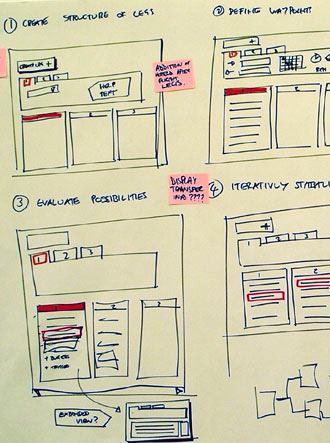
Concept sketches – have lots of ideas

As Linus Pauling said, to have a good idea, you need to have lots of ideas. Successful interaction designers avoid just going with the first idea they have – they produce lots of different ideas and let the ideas grow and build before starting to trim them down.

But mocking all those ideas up in slick detail, or expensive code, would slow you down. So it’s best to keep initial concepts cheap and disposable.

Some concept sketches done with pen and paper

Testing the concept

To test a paper aeroplane, you throw it across the air field. To test an interaction design concept you put it in front of target users. After all it can’t interact by itself – you need people for your concept to interact *with*.

Testing several sketch concepts with target users sounds like it might be difficult, pointless or embarrassing. But it’s not. People feel able to give more truthful feedback when they know you haven’t slaved too hard on each concept And there’s solid scientific evidence that asking users to try out and compare several low-fidelity prototypes will get you more useful and trustworthy feedback than any other approach.

(Messing about with sketches is also a genuinely fun way for a respondent to spend an hour.)

Prototypes – perfecting the details

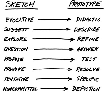
Once you’ve selected a winning concept, you need to start working through the interaction in increasing detail. It’s a different stage in the project and requires a different style of thinking. Bill Buxton’s diagram below shows the key differences.

Bill Buxton's diagram shows the differences between concept and prototype

Imagining an interaction without documenting and testing it is like trying to do long division in your head – painful and easy to lose track. There’s a growing range of powerful tools that can help us mock up, step through and tune interactions in detail – Axure RP Pro, Simunication, iRise, Caretta Gui Design studio for example. (There’s also PowerPoint – Microsoft used it to design Office 2007.)

But there’s a pitfall to watch out for: the constraints of the tool can constrain your thinking. “I want to make a panel pop up here, but I don’t think I can do that using the prototyping tool.” If you catch yourself saying that, you know your prototyping tool is a problem.

Agile – the product is the prototype

But when you’re building really complex interaction (typically a web or desktop application) it becomes almost impossible to mock up the interaction without too much work.

This is where an agile approach is really helpful. Agile methodologies encourage developers to produce working software in short “iterations” that build incrementally towards the finished product. Stakeholders and users can play with each iteration and feed back on it. There’s little or no formal specification at the start of the process, and agile programmers fully expect to have to make some changes of direction along the way.

I’ve found that working on these projects can be tiring and scary – there’s very little time to sit down and think things through before someone has started coding it. But once you get past that, it becomes liberating. Agile projects reject the fiction of the waterfall approach – that someone can deliver a perfect interaction specification up front, without ever really seeing the product working.

Humble beginnings

Whichever way you go about it, designing and engineering a good interactive experience needs concepts and prototypes. They may look rough and ready to start with. But don’t let that discourage you.

Remember Concorde. The finished product was expensive, ground-breaking and glamorous. Those very first paper planes were not.

iPhone: A whole new chapter in user experience

I had the experience: 20 minutes with an iphone. Thanks to Gary Marsden for the opportunity.

People have said “oh yeah the iphone is really good.” Some have said “It’s really REALLY good.” But I thought they were just Apple groupies.

They didn’t convey just how good it is. It’s astonishing. My jaw dropped. And when my wife tried it, her jaw dropped too.

Now I’m an Apple sceptic. I find Apple devices rarely live up to the hype. So this is not an Apple-worship post.

This post is about how the iPhone is ushering in a dramatic shift in the world of user experience.

Adding more feel

There’s a term that bobs around in the world of technology: “look and feel”. Look gets most of the attention, and often, feel is something we struggle to define.

That’s because most applications feel the same. We click buttons, we slide scrollbars, we press keys. Nothing has really changed in years. And we reached the point where we all forgot to look for alternatives.

What’s special about the iPhone is the feel. You use it by making gestures, and touching it with several fingers at once. You flick at long lists to make them scroll fast. You pinch photos to make them smaller and stretch maps to zoom in. You don’t just interact with an iPhone. You conduct it. You play it. You treat the things on the screen like real-world objects (slightly magical ones). Using it is a great experience and I really urge you to seek one out and have a go.

(Yes I know it’s not perfect. It’s no good if you need to operate it by touch alone, it requires two hands, and it requires us to use our thick and clunky fingers. But that doesn’t stop it being amazing).

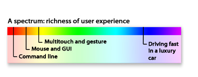
With this new kind of user experience, we’re inching up through the spectrum – towards fuller, more engaging, experiences. We’re still miles from the rich, real-life experience of a fast drive in a luxury car. But we’re closer than we were.

A spectrum: richness of user experience. From the DOS prompt at one end to the experience of driving fast in a luxury car at the other.  Multitouch takes us a bit further along.

That’s cute, you say. It takes feel to a new level. But so what?

Well, this new kind of user experience will have a very real impact on our lives and the digital technology business.

A step-change

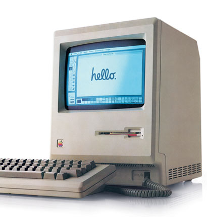
Think of it this way. In 1984 there was a small grey box with a mouse and some basic GUI capabilities: the Apple Mac. Humble, yes. But it was the first commercially successful GUI computer. 23 years later hundreds of millions of GUI operating systems are installed across the planet. And that has enabled us to build at least a couple of new industries, and transform the global economy. That’s right – we couldn’t have done it with just the DOS prompt.

Humble beginnings: The original Apple Mac.

The history of the internet is another great example. Only when the first graphical web browser, Mosaic, brought images and clickable hypertext to our screens, did the internet finally go mainstream.

A change in the way we use computers – allowing us to do the same things better, and tackle new things we haven’t yet imagined. Explosive growth. Life- and economy-transforming results. The iPhone is the beginning of another round of that.

What kind of company that can make things like that?

As Harry Brignull and Bill Buxton have both pointed out, Apple stood on the shoulders of giants to make the iPhone. Multitouch research has been going on since the early eighties. The games industry has been making use of gesture and natural physics for years now. And smart phones have been around for a long while.

Happy representatives of generation Y show us the future of interaction with Nintendo Wii.

What Apple did, though, was to throw out one heavily-entrenched assumption: that phones had a keypad, a yes, a no, and two softkeys. Once they did that, they gave themselves a new opportunity to pull together a range of ideas and technologies into an amazing device.

For that they deserve enormous respect. Very few organisations in the world can throw out that much inherited wisdom, and demonstrate that much innovativeness, foresight and guts. Many wish they could. But for most, the risk seems too great, the politics and processes are too stodgy, the desire to just get something “good enough” out there is too strong. (The trick: follow a user-centred design process to de-risk your innovation projects.)

Who dares wins…

Well, it looks like Apple will sell 6% of the coming year’s smartphones. And Microsoft, will sell 5%, even though they have been in the market for years with Windows Mobile and Pocket PC. That tells us something.

But whatever happens to the iPhone, we can be sure that multi-touch and gestural interfaces are going to change the experience of using computers forever.

(Thanks to Ann Light and Martin Storey for their contributions to this post).

A balanced user experience starts with the box

Recently, Joel Spolsky pointed out the brilliantly obvious: the groovy new boxes for Microsoft’s next generation of software offer a poor user experience. As Joel points out,

A box that many people can’t figure out how to open without a Google search is an unusually pathetic failure of design.

For those of you who want the full details, my colleague Karl Sabino has dug out the official Microsoft help page for opening the box.

1. Cut the tape along the edges of the box

2. Peel the label off the front of the box3. Pull the red tab to the right to open the box

Yes that’s right. A help page for the packaging.

I’d love to know the traffic stats for this page. By assuming that each page impression corresponds to about 10 minutes of user frustration, we could calculate the total amount of customer time wasted by this nonsense.

Still, I guess we should be thankful that the same designers aren’t working on the escape slides for Boeing.

Balancing easy, useful and delightful

Microsoft have recently been talking about the importance of the aesthetic quality of a good user experience. Good for them. It’s very important. Beautiful products make us more likely to try them out and, by putting us in the right frame of mind, make us more effective at actually using them.

But this box seems to illustrate the problems of going too far towards the aesthetic, and forgetting the easy/useful part of the equation. It’s cute, groovy, cool – but it’s a pain to use. And that’s not a balanced user experience. That’s where the web was back in 1998, and we all thought things had moved on since then.

“It’s a business requirement”

Maybe the box is hard to open for business reasons. Perhaps its some anti piracy measure or linked to the licensing agreement.

That’s no excuse. If a business “need” inconveniences customers, it needs to be re-thought. Why? Because if you treat your customers badly, they’ll treat you badly – asking for additional expensive support, requiring heavy marketing expenditure to avoid churn, damaging your brand with negative blog posts. Which all cost you money in the end. In the words of Colin Shaw, “You get the customers you deserve.”

Patching the hole

One thing that Microsoft have done right: issued a “service patch”. They know there’s a problem with the customer experience and they’ve done what they can in the short term to take the edge off the problem. They’ve published a web page. The next step is to stick the instructions to the box, so that you don’t have to search the web to find them.

Son forms software company to resurrect dad’s genius ideas

Thanks to Darryl Hebbes for pointing me towards this one: Humanized Inc.

In the eighties, one of the original Apple Mac gurus, Jeff Raskin, came up with some crazy ideas about human computer interaction. Most of his ideas were just too radical. Now his son is taking those ideas forward with a new business venture.

The design trip

One of Jeff’s inventions was the auto-cancelling, semi-transparent notification. This was a “crazy idea” but it’s- now built into many email clients and mobile phones.

Jeff was also the first to point out the the whole concept of file names and the way that file-save and file-open work are actually fairly “in-humane” – they don’t match the things we as users want to think about, when we want to think them. And he was a big fan of GOMS – modelling the most efficient way to get an operation done in terms of keyboard and mouse clicks.

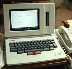
The design trip culminated in the creation of the Canon Cat. A computer with a radically different approach to the user experience that Jeff called a “humane” interface. It featured “Leap keys” and kind of continuous notepad – you never really created files, you just started a new page. You used search to find the page you were looking for. It flopped wildly.

The canon cat

Raskin wrote an amazing book called The Humane Interface which I would REALLY recommend.

Jeff died in 2006. Many of his most radical ideas are sitting out there waiting to be brought into the main stream. They make a lot of sense, but you just need to think outside the paradigm of how you use computers at the moment. (After all do you really find using your computer effortless? Of course not. Maybe Jeff’s ideas can make that happen.)

Enter Humanized Inc.

It’s a new company recently set up by Jeff’s son. How cool.

They’ve started with a tool to make it easier to start applications and bring windows to the front. They’ve also got a special spell checker. They’re working on an RSS reader next. I can really do with that last one.

When it comes to easy software they recommend the “Telephone test”:

We ask ourselves, “Would I be willing to teach my Grandma how to use this over the phone?”. If the answer is “Definitely”, we know we’re doing well; if the answer is “Maybe”, we know we can do better; and if the answer is “No”, then it’s time to rethink the whole thing.

I think this is wonderful.