The RAZR cuts deep

This from Bruce Nussbaum…

Carl Icahn, who is constantly called “the corporate raider turned shareholder activist” is battling Motorola CEO Ed Zander to get a seat on the board of directors and use the company’s cash to buy back stock–including his own Motorola stock. Zander and Motorola are vulnerable to this squeeze because of the sharp decline in the profits derived from the great selling Razr cellphone. Motorola has been cutting its price all year, especially in emerging markets, and is losing market share to rivals Nokia and Samsung. All this before Apple launches its iPhone.

And then…

But the Razr turns out to be bad design, really bad design, because it has an awful user-interface. I personally know nearly a dozen people who truly hate their Razrs, including a number of top designers. People have a very hard time with just the basic features, such as phone numbers, texting, sending photos, even hearing well. There are lots of consumer complaints. The truth is, despite its terrific outside, the Razr runs on an old, homeground operating system that Motorola is only now updating.

So the Razr, in the end, reflects old-fashioned design–form over function. The resulting poor consumer experiences for a huge number of people may make it harder for Motorola than it anticipates to recoup in the marketplace. In a competitive environment where people can easily buy Nokia or Samsung phones, and now Apple iPhones, memories of bad expiences with the Razr may make them very reluctant to try another Motorola cell.

See?! See!!!? The stories of the the bad UI on the RAZR are legendary. The UI community knew it would get them in the end. And now it has. (Somewhat).
Good design is a long term bet.

Interestingly, though, it’s now time to market that’s plaguing Motorola. By all accounts, they’ve got people working on a new and genuinely usable product range (I even met one of them a while back and I can certify that he was cool). But because it hasn’t come to market quickly enough, they’re left in a jam.  Of course, if they’d done it right first time, they wouldn’t have got into the jam in the first place.

Anyway, there’s more detail chez M. Nussbaum so have a read.

Delta airlines – now serving cheese?

If you never had the experience of travelling Delta, count yourself lucky. It was austere and souless as only an old american corporation can be.

They’ve rebranded with a natty, new, all red, 3D logo. And their new site welcomes suggestions and tips from travellers in an effort to collect ‘easy-win’ ideas such as onboard multi-player gaming, buzzers to alert tell you when to go to your gate, SMS to update you about flight disruptions and a book swap at the gate. See the press release for a mix of suspicious, cheesy nonsense. Or see the delta site.

For many large organisations, even considering this kind of user involvement would be to terrifying. “What if we couldn’t implement any of the suggestions our customer gave us? What if I customers suggested something subversive? Do we really have to listen to our customers anyway?!”

So kudos to Delta for getting this far.

But at the same time, it’s still a cheesy effort. There’s an “air-punching” promotional video. And everything is very sanitised.

I don’t really know what to think. Except this. Would this new effort make me consider flying with Delta?

Answer: Yes. I’d give them one shot. If the experience really does live up to the new brand promise, then they’d have succeassfuly bought themsleves a new customer. So I suppose that means they’ve achieved something.
But it’s a big if. And I’m not holding my breath.

Thanks to Flowsters Simon Hatch and Kelsey Smith for pointing me to this.

I defected from Nokia

I’ve just got a Sony Ericsson K800i.  My first ever non-nokia phone. Could have got a N73. But I didn’t.
Why? The K800i was good looking. The camera design appealed. The screen and icons seemed luscious.  And people said it was easy to use and they were happy with it.

I had a moment of trepidation when  I got it home. What have I done?! (That’s the power of brand loyalty coming from years of good user experience with Nokia).

But I’ve been using it for the afternoon and I’m very happy.  Maybe because in many respects it’s a Nokia clone anyway, just with better looks.  Or maybe an N73 would have been WAY better but I’ll never know now!  Or maybe, just maybe, it’s a good phone.

Two interesting things:

1. I couldn’t work out how to open the memory stick slot. I Googled and found that others also struggled. (Several “I know this is a silly question but…” postings). Answer: stick your fingernail under the flap and pull until you’re sure it will snap. And then the door pops open.
2. It’s not very self confident.  It keeps asking me to confirm things instead of just doing. Like when you prepare an SMS – it double checks before actually sending it.  And once it’s sent it asks you to click “ok” to acknowledge the dialog box. Hmm. I think Alan Cooper might accuse it of not being “self confident” and Jef Raskin might have accused it of wasting information.

Comparing the blogosphere to the stock market

I was thinking the other day about the similarities between the blogosphere and the stock market. Back in the 17th century, people were pretty excited about the radical new concept of stockmarkets – and rightly so. They are fascinating things and present all sorts of opportunity to everyone. (Read Niel Stephenson’s Quicksilver, if you’ve got the biceps). Right now, we’re all pretty excited about the democratisation of media that the blgosphere offers – and it’s for the same reasons.

But the stock market and the blogosphere are complicated and time-consuming places to hang out. So I’m interested in the various ways that the stock market has been made more user friendly. I want to see if we’re using them all to ease people’s experience of the blogosphere.

To find a good stock to invest in, you need to do research and rummage around. For the layman this can be too much like hard work, and a big drain on time. That’s why we often rely on others for help finding the right stocks.

Who helps us…?

  • Newspapers and magazines that offer stock tips
  • Financial advisors – some sophisticated, some not
  • Fund managers, via the funds they create
  • Indexes, like the FTSE100
  • Algorithms. A lot of the trading that happens on the stock market today is actually done by computers.
  • And the market itself – shares that regularly yield good dividends, get a higher value. That’s the whole point.

It looks like the blogosphere equivalent of an index is something like Nine Rules. The FTSE index is a selection of the biggest hitting corporations on the London Stock Exchange. Nine rules is a bit like that – the creme de la blogosphere get to be in the club.

Funds, and investment trusts in particular, are worth a look. An investment trust is a share in its own right – traded on the market just like any other. But it is a share in a company that does nothing else but buy and sell shares in other companies. The lazier or less expert investor can get the benefit of playing in the market, with much of the risk and effort taken out. They trust the fund manager, who has done well in the past, to continue to select the best stocks and deliver the best return. Interestingly, an investment trust share can trade at a discount or a premium. That means that the market can value a trust *more* (or less) than the total of the shares the trust actually owns. The trust itself can add value, by being well managed, I suppose.

The analogy works for me on the blogosphere. I am interested in investing (my attention) in shares (blogs) that are actively managed (edited) collections of the best shares (blogs) out there. I’m after someone who selects the best blogs in my sector on an active basis. And I want to rely on market ratings to make sure that the manager is doing a good job. If he’s losing readers and rankings on the open blog market, I might switch away from him to another, better managed blog instead.

Anything we can really learn from this? Well – there’s more than one way to navigate a complex market. And there’s probably plenty of opportunity left for organisations and individuals out there who want to help us.

And that begs the question: can people make money being blog fund managers? Or do they do it for love?

Innovation – a long term approach that saves time

From the Nussbaum on Design blog at Business Week…

“…thinking about it in terms of “one-off” innovation (get me another iPod> quick!) doesn’t make your company innovative. But thinking about The Discipline of Innovation–and what that implies in terms of building a culture and organization–does.”

Absolutely! Brilliant innovations don’t just appear from nowhere. They can only grow in environments that support and encourage innovation.

You also need a culture that understands what worthwhile innovation really is. One interesting viewpoint:

“The only worthwhile innovation is a profitable innovation.”

This is from Payback, a book by some clever folk at BGC. And there’s a lot to be said for it. (Though there are some very worthwhile government and humanitarian services which are not profitable, surely).

The book talks about the “cash curve”, the S-shaped curve of cumulative cash spent or earned during the course of an innovation project. The curve dips below zero to start with, as you invest in the project, then, ideally, rockets above zero as sales of your product or service takes off. Except that for many projects, it never makes it back above zero, but bumbles along in the red, requiring an endless stream of further investment to keep it alive.

Successful products usually need a large volume of sales before they achieve payback. So the key factor, they point out, is not time to market – it’s time to volume.

This is great ammunition for supporters of user-centred design (UCD). Organisations that understand they are trying to reach high volume need to invest in customer satisfaction – making sure their product is easy to use and fits with customer needs. In other words, they should do UCD.

UCD is about taking a longer term view. It’s about selecting the right projects based on an understanding of user needs. And it’s about not just getting the product out the door, but getting the right product out of the door, even if it takes a bit longer. That way, the cash curve doesn’t flat-line in the longer term.

So there we are. Yet more evidence to support the UCD case: UCD reduces your time to volume.

Ubuntu: Is Linux is crossing the chasm?

BBC News says that Dell are going to start shipping consumer desktops with Ubuntu linux on them. For ordinary people to use.

I think this is cool because the geek in my loves unix and the dad in me has no time to actually configure unix boxes to do useful things.
But it made me think: I’m not actually interested in cutting edge products and fads. I’m interested in the stuff that lasts, and that the early majority or even the later majority can adopt. As someone clever said at a conference once: “Getting a video call on your mobile is cool. Getting a video call from your mum really shows that technology is having an impact.”

So if you’re reading ths blog looking for the latest insight into cutting edge technology, you’re in the wrong place. This blog is all about the stuff that makes it, or should be making it, across the chasm and over the adoption curve.

(For an explanation of all this curve and chasm malarkey, see the Wikipedia page about it).

Property search engine usability

We’re house hunting in South Africa at the moment and we’ve tried just about every property website there is. We’ve seen some shockers, and we’ve been surprised by some very good, usable web design.

When you compare the best performer with the worst offenders, it does highlight how making your website usable really is a very good idea if you want to deliver a worthwhile return on your investment.

Compare these search engine interfaces from the the homepages of…

1. PropertyGenie

Property Genie search engine

2. Remax

remax search engine

Ask yourself a simple question: How quickly can you work out what to do with interface number 1? And what about number 2?

Quite.

Ah, Remax. Why are some suburbs in dark blue with [All] written next to them? What is the suburb filter box for? Will you remember to hold down CTRL to select multiple suburbs? Which parts of step 2 will light up when? What “payment type” will you select – can you pay in bushelss of corn?

The Remax functionality is all good. Those are all criteria that users might want to filter by at some point. But most people won’t want to set most of those criteria most of the time. And providing a huge control panel to let people do all that stuff at the beginning is just bewildering and off-putting for most normal house hunters.

A couple of key lessons that good designers have known for years:

1. Don’t ask people to set search scope before when they are entering their search query. If people want to search for something, let them type it in and see how many results there are. Then when the necessity of narrowing the search becomes apparent, people will feel motviated to go to the trouble of doing so. Proprty Genie gets this right. A simple search first, supported with solid geaopgraphical data that matched my desired suburb on the first attempt. Then simple filtering controls that get shown after you’ve seen the initial search results.

2. Make easy things easy and difficult things possible. In other words, design for the main things that people want to do and make those things very, very easy. Then add the “edge case” functionality in low priority places where it won’t clutter things up.

Remax have put up an interface that ignores these two basic interaction design patterns. And as a result, I’m sure they are missing out on a lot of traffic and a lot of business. There’s a lesson for every website owner in there somewhere.

Property Genie goes on do display some fairly usable sort controls too.

Property genie sort controls

These controls show you (a) that you can sort and (b) what you can sort by. Nice. (I’m struggling to tell which radio butotn goes with which label though).
If Property Genie granted me three wishes, though, I’d ask for larger property pictures and a click through to the agent’s own site for more details.

The third wish would be a lovely villa on Clifton Beach. But that’s another story.

Those youngsters! They should straighten up and fly right.

Behind the curve as ever, I read about Andrew Keen and his “anti-web2.0” stance in the Observer. Thanks, also to Matt Buckland, for pointing me at it.

“The author and entrepreneur has stunned his adopted country with a book that accuses bloggers and other evangelists for the web of destroying culture, ruining livelihoods and threatening to make consumers of new media regress into ‘digital narcissism’.”

I think Mr Keen is doing well at generating PR and that’ll make sure he sells lots of copies of his new book. Clever chap. He’s also acting as “the opposition” and every power needs an opposition to keep it on its toes.

But there’s a lot of hot air here too.

A lot of the stuff that people worry about is teen culture. Grown-ups have always thought that teens were doing something shocking that would undermine society etc etc. And much of the blogging/community stuff that he seems to object to is no exception. Young people do dumb things and think they are clever. And they do things that look dumb and are actually clever. It’s all mixed up in there somewhere. And then they grow up, their revolution becomes mainstream and they start worrying about what the next wave are up to.

It’ll all come out in the wash.

The problem comes when we try to tar everyone with the same brush. In interaction design you divide up your target audience – using personas usually. And you don’t expect all your users to want the same things or do the same things. Some TV programmes appeal to more mature audiences, some are for kids.  Some books appeal more to women, some more to men.
It’s much the same here. Some college students will blog avidly about trivia. But that doesn’t mean we all have to. Or that we all have to read it.

But a few things I do believe:

  • There is far too much to read, and I don’t know what’s important. As a result I read almost nothing. I need to go find something that’ll digest stuff for me.
  • Anyone who wants to keep up will have to spend hours every night reading, instead of watching TV. And wasn’t it watching TV that was supposed to be rotting our minds, according to the previous generation…?
  • Most of the people who are not talented at communication and authorship will not get a big audience because people will not enjoy their stuff. And the ones who are talented deserve a chance to prove themselves without having to slog through mindless “cat-up-tree” stories on local rags. It’s a free market thing. The survival of the fittest.
  • I do believe in the power of the network and the wisdom of crowds. I think that mechanisms that let us connect and share quickly, in large numbers and with some kind of non-hierarchical structure enable us to do things that we, the human race, have never been able to achieve before. That is exciting. And I think it’s good for the world economy too. Read “The wisdom of crowds” to see the evidence that this stuff works.
  • Alas, just like in democracy, you actually have to do your bit and vote. So that means I’m condemned to wading through trivia so that I can lend my support to the good stuff. Bother.

So. Well done, Andrew Keen, for causing a stir. Well done, everybody else, for driving humanity to new levels of achievement though Darwinian crap-filtering. Keep up the good work. I’m off to stare at a blank wall for a while.

Usable toilet doors

From BBC News Online…

‘[Virgin trains] denied reports in the Daily Telegraph about automatic doors opening unexpectedly or locking people in.

Problems with disabled toilets on the hi-tech tilting trains however were down to people not using the automatic doors properly, a spokesman said.

“There’s a button to close the door and another with a key symbol on it which locks the door and flashes when the door closes,” said David Ewart, communications manager with Virgin.

“It’s pretty clear what you have to do. We’ve even got signs in Braille,” he added.

Rail watchdog group Passenger Focus, however, said there might be a need for Virgin to have clearer instructions for customers.’

What a mad world we live in where people design electronic toilet door buttons… and get it wrong! And some poor soul ends up getting caught with their trousers down on the 9:13 from Birmingham New Street. Surely a manual door would have been ok. Then a nice handle which affords sliding would have been crystal clear.

But now we’ve got watchdog groups to make sure that the toilet doors get improved. And reporters to write stories about the whole business. And bloggers to blog about it. And Virgin has to refit the doors, and create improved signage.

Think how much time and money could have been saved if the engineer had just designed the door right, and usability tested it in the first place. Then the whole lot of us could go off and do something more meaningful. (There is a lesson here about hasty roll-outs of interactive products and the true time and cost of reaching customer satisfaction. But I’m not going to spell it out any further).
PS. If anyone ‘goes’ on a pendolino, do try and get to the ‘bottom’ of this one for me.

Marketing AT people

The blog has been even quieter than usual, because I’ve been in the process of moving to South Africa. It has been one of the most relentlessly busy times of my life, but now that I’m here it looks like it was all worthwhile. Capetown is a great place.

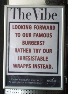
I’ve seen some truly strange ad copy in South Africa – stuff which just makes you wonder “who approvated that?” But the sign below, inspired some thoughts about user experience and digital marketing tactics, so I thought I’d blog it.

A sign in a cafe in Cape town: Looking forward to our famour burgers? Rather try our irresistable wrapps instead.

I stared at this one in disbelief. It showed a total disregard for what the customer wanted. You came for burgers? Well we don’t care. Eat wraps!

(If you look carefully, it’s actually because they are refurbishing their kitchen and can’t do cooked food. But that’s a fact the poster spectacularly fails to convey).

When you see it in a real-world cafe, this behaviour strikes you immediately as ludicrous. But a lot of folk I’ve worked with have been happy to put this kind of stuff up on their website. Users usually come to e-commerce sites with goals in mind: investigate options in a product category, see the prices and features, or buy. But so often the majority of the pages they see during their journey are devoted to promoting “offers” that the marketing department want to push. Offers that usually have nothing to do with the particular goal that the user had in mind. “You wanted burgers? Well we’re devoting this page to our amazing wraps. So buy them instead.” Most people I’ve worked with in usability tests will say “this site isn’t relevant to me,” and go elsewhere.

Why do marketers keep doing this? A few reasons, I think…

  • Marketers believe they can make people think things. The old school says that consumers can be made to think whatever you want them to think just by shouting loud enough. Much research has shown that this really isn’t the case. Take a look Gerald Zaltman’s at How Customers Think for more on this.
  • Marketers have to shift product. And if there’s a job lot of product to shift, they need to shout loud about it to try to drum up some interest. This is all well and good in the short term, but it’s probably not going to have a beneficial effect on your customers lifetime value.
  • Stats show that people click on promos. A big fat promo might be the most clicked single item on the page. So it looks successful. But if you’ve got the analytics for it, you can follow through and see how many of those initial clicks actually turn into conversions. Usually, it’s not many. And if you look at the aggregate of clicks to all you navigation from that same start page, you’ll see that a much bigger total are ignoring the promo and finding another way to go off and look at what they came for.

Sales people have a much more rational approach: find out what the customer wants, and what factors will deliver or impede a sale. Then suggest a relevant product and work on those factors. Good e-commerce websites tend to use those tactics too.

But enough of all this customer experience guff. I’ve just had a consignment of fabulous electric toenail clippers delivered and I can let you have one for only $14 plus tax and shipping. Buy one NOW!

Hey, where are going….?!